Revamped User Interface In Google Tag Manager
It’s been a crazy week. Just crazy. Not only did Google Tag Manager introduce Workspaces, arguably one of its most important releases ever for GTM, but they also revamped the user interface! So very big changes have been underfoot, and I’m so happy to be writing about them, because in my completely biased opinion these changes are amazing and well worth the long wait.
In this article, I want to quickly walk you through what I think are the most meaningful changes in the interface. A lot has changed, but the underlying mechanisms of GTM are still the same. You’re still creating Tags, Triggers, and Variables, and you’re still debugging the container using Debug Mode. However, the new user interfaces enhances and streamlines the various creation processes in the container, and the new Abandon / View Changes feature allows you to debug and diff the changes you or your team has made.
XThe Simmer Newsletter
Subscribe to the Simmer newsletter to get the latest news and content from Simo Ahava into your email inbox!
1. The overlays
The new interface, starting with its flashy account selector menu, just reeks of Material Design. The added third dimension to navigation provides a completely novel experience for GTM veterans.
A historical pet peeve in GTM had been that if you’re in the middle of the Tag creation process and you notice that you need to configure a new Trigger or Variable, you were taken away (or had to leave) the Tag view in order to configure the secondary asset in a separate part of the container. Even though this was largely fixed a while ago, it still leaves a clunky feeling with the page transitions and the staggered workflow.
With the overlays, you will never leave the location you are in. The overlays fly in so that they do not cover the whole page, so you’ll always know where you started off from.
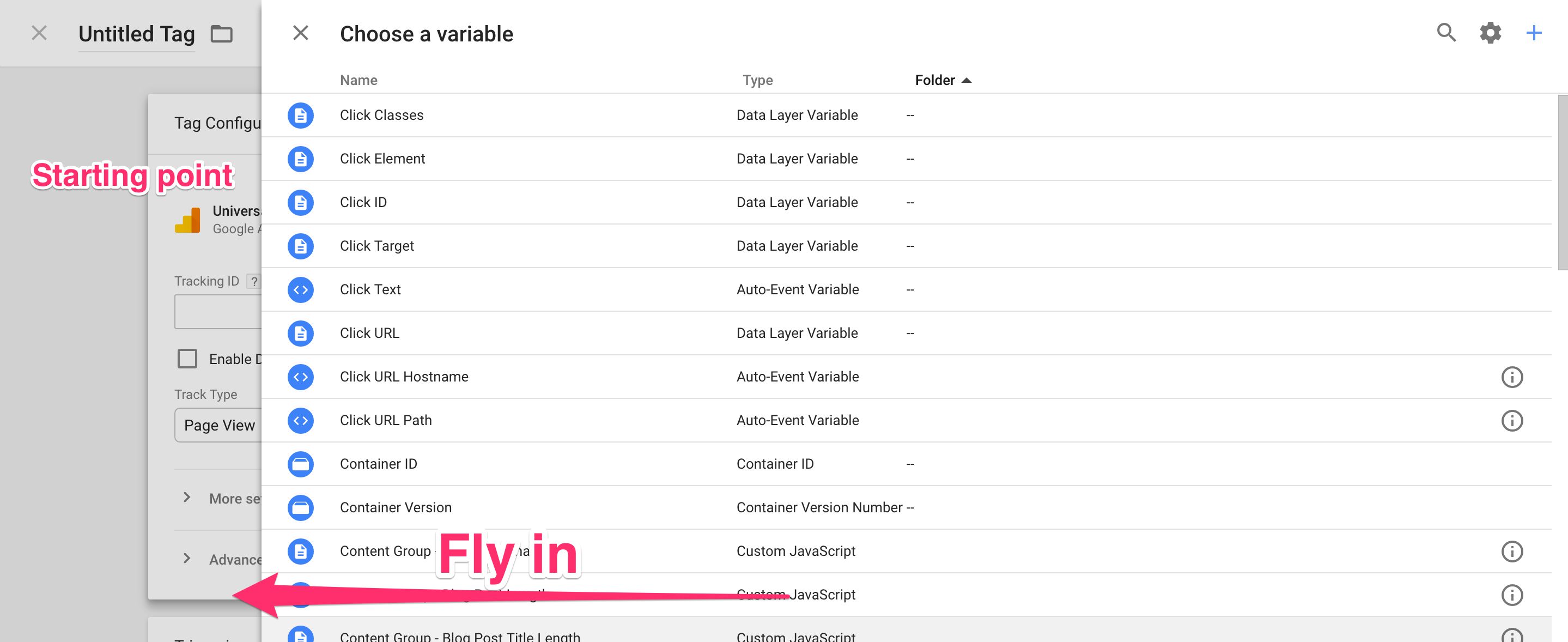
Moving back in history is as easy as clicking the X in the top left corner of any overlay or just clicking the shaded area in the left-hand side of the screen.
This, in my opinion, will save time and grey hairs. These overlays will take time to get used to, but it’s well worth it. You can zip and zap through a Tag creation workflow in a fraction of the time it used to take.
2. The Overview
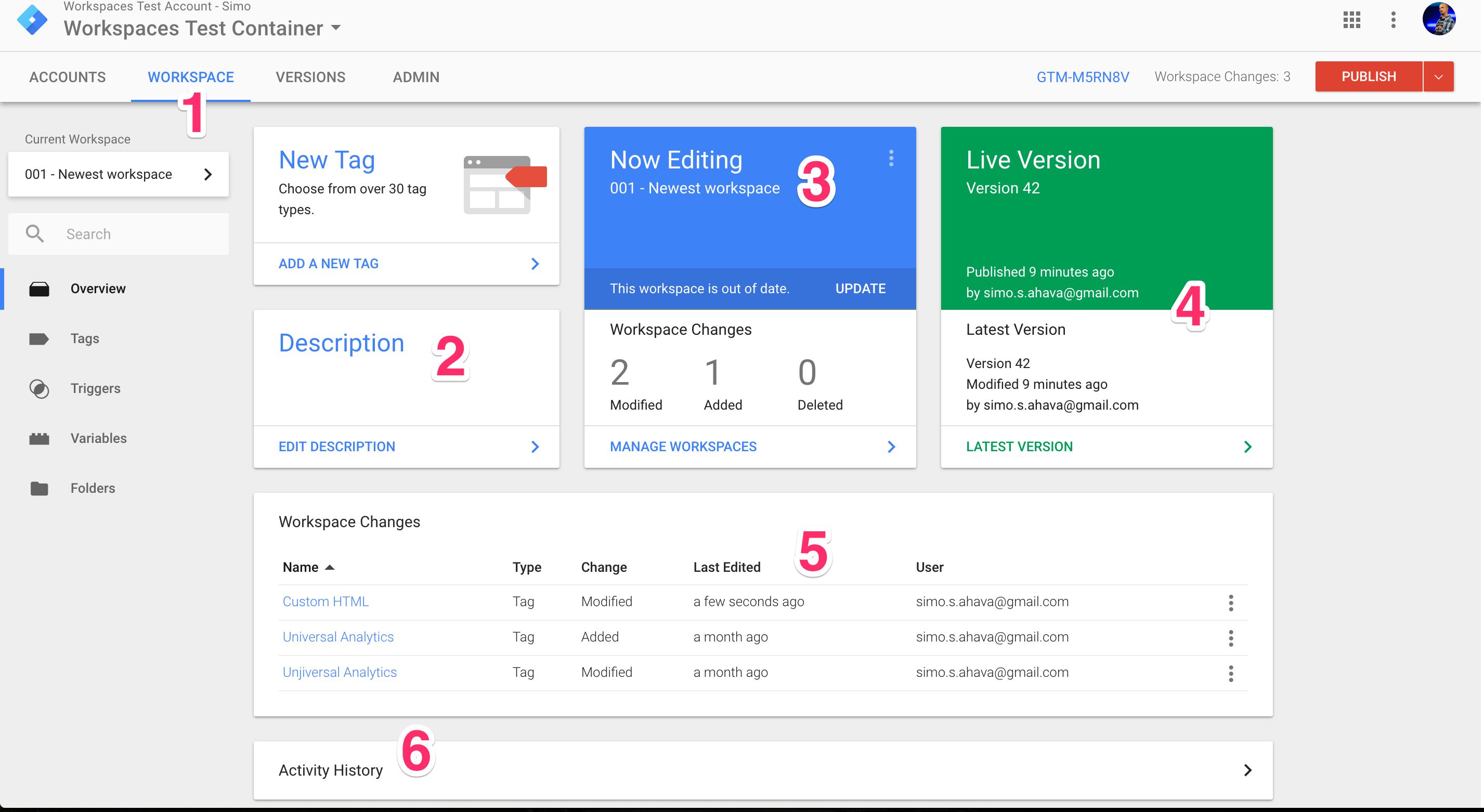
The Overview screen has been slightly revamped, especially if you’ve already started working with Workspaces.
-
It’s not “Container” anymore in the navigation bar, it’s “Workspace” now. Makes a lot of sense, since you will always be working in a Workspace.
-
You don’t add notes to Versions anymore. Instead, you modify the Description of a Workspace.
-
The center panel used to hold information about the current version. Now, it tells you what’s going on in the current Workspace.
-
The panel to the right used to be solely about the Published Version. Now it’s split into two, giving you the run-down on the Live Version (i.e. the Published Version) as well as the Latest Container Version. The latter is very important for Workspaces, as the Latest Container Version is what your workspaces will merge to/with. Clicking either half will take you to the respective version page.
-
The large center area is reserved for changes in your Workspace when compared to the Latest Container Version. Every change you make in Workspace is a divergence from the Latest Container Version.
-
The Activity History used to be for the whole container, but now it’s just for the current Workspace. To see activity history for the container, you will need to go through the Versions section of the container.
-
The PUBLISH menu is now red when you have pending changes, and next to it is a counter with the number of changes the current Workspace has introduced. If you click the Container ID (GTM-XXXXX), you’ll see an overlay with the container snippet and instructions for its installation.
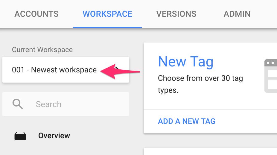
Note also the “Current Workspace” selector in the left-hand navigation. There’s more details about this in my Workspaces guide.
3. Timestamps!
This is minor but still major. You know how irritating it always was to just see relative timestamps instead of proper ones? “3 days ago” as a Last Modified time isn’t that informative, right? Well, we’ve been offered an olive branch. By hovering over any relative timestamp, you’ll see the actual timestamp in a tooltip.
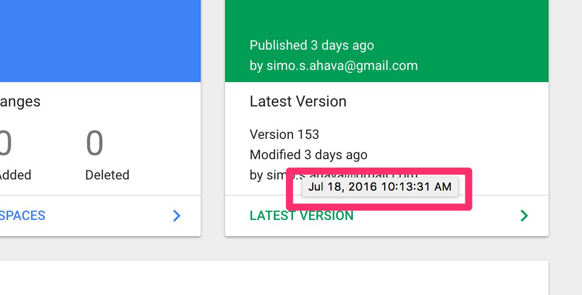
You can argue that it would be better to only have the actual timestamp visible and none of this relative timestamp bullcrap, but this is a step in the right direction, definitely.
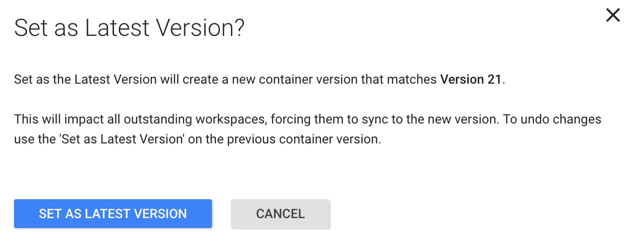
4. Versions
There’s just one important change to the Versions view itself. What used to be “Edit as New Version” is now “Set as the Latest Version”. This is, again, because of Workspaces.
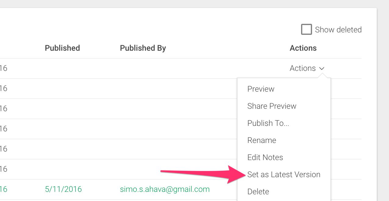
When you set a version as the Latest Version, it has implications for all active Workspaces, as they will all need to be updated with the changes in this Latest Version. So don’t be cavalier when using this feature!
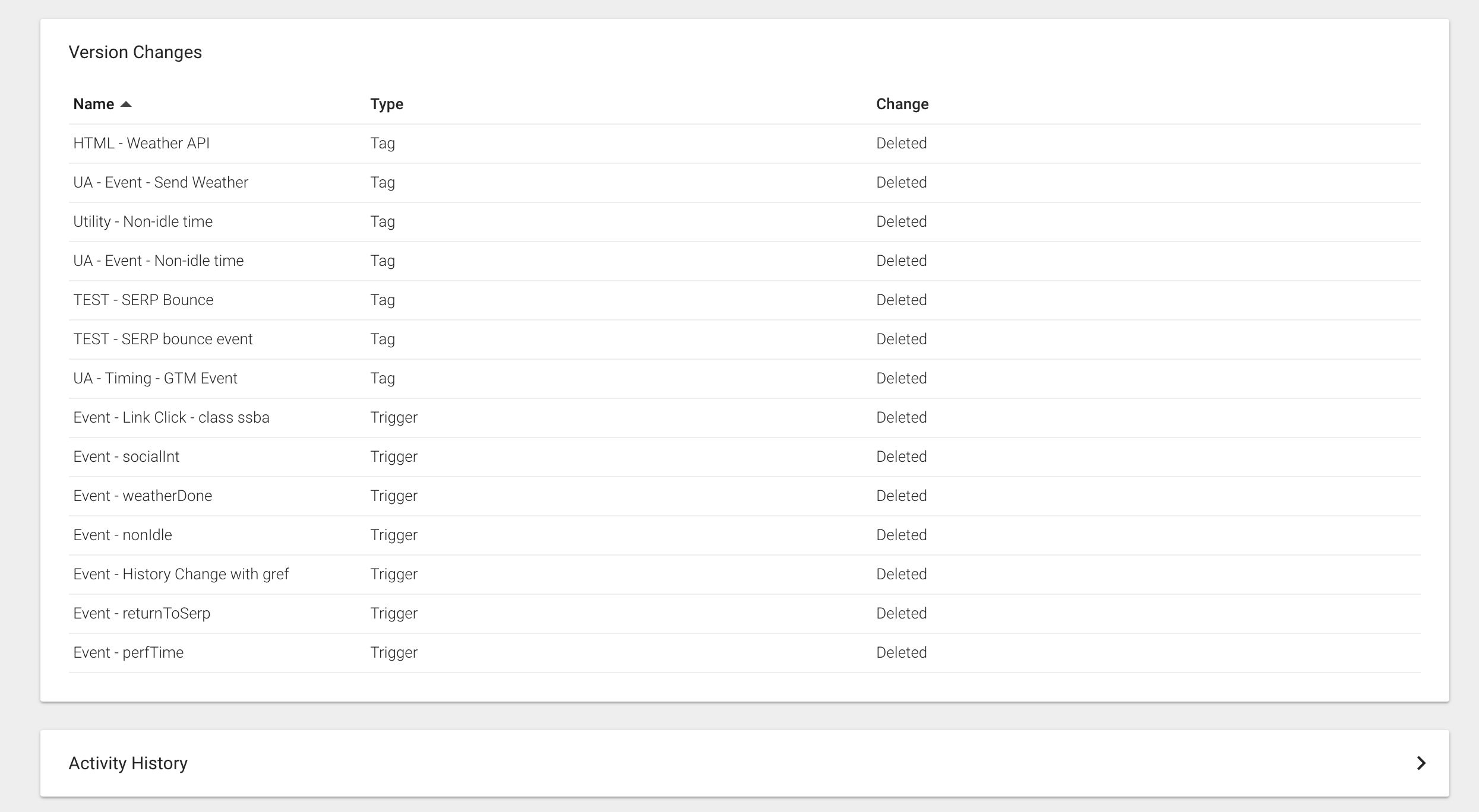
The biggest change to the Version page itself, apart from the new UI, is that there’s both “Version Changes” and “Activity History”. Version Changes describes the changes in this version compared the previous Latest Container Version. Activity History is a more detailed list of what things were done in the version and, importantly, by whom.
5. Tags
So, now to the juicy part. As I said in the beginning, the workflow has been streamlined to the maximum. There’s lots of little changes here, so I’m sure I won’t be able to cover them all. These, however, are the ones I’ve found most meaningful.
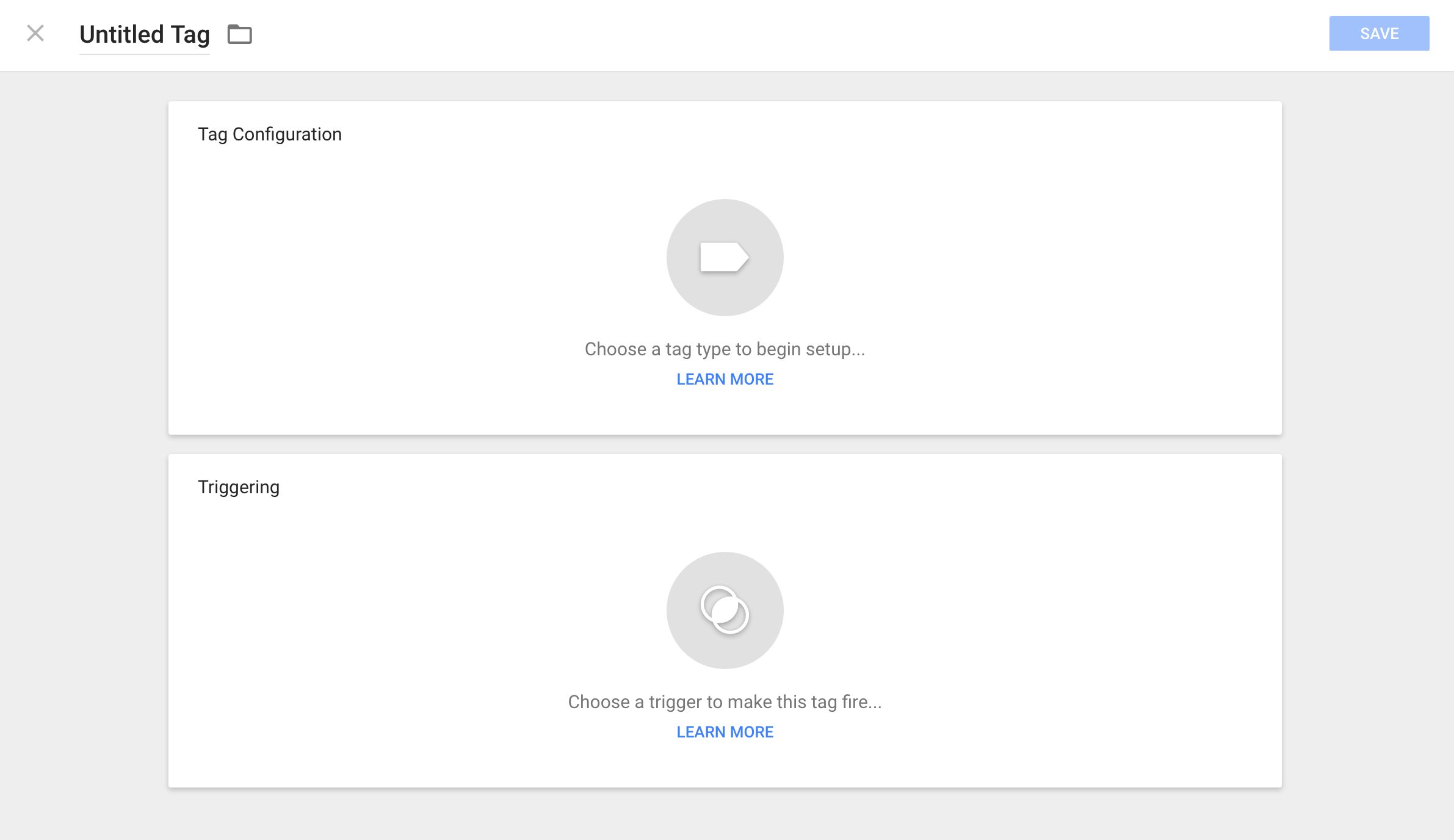
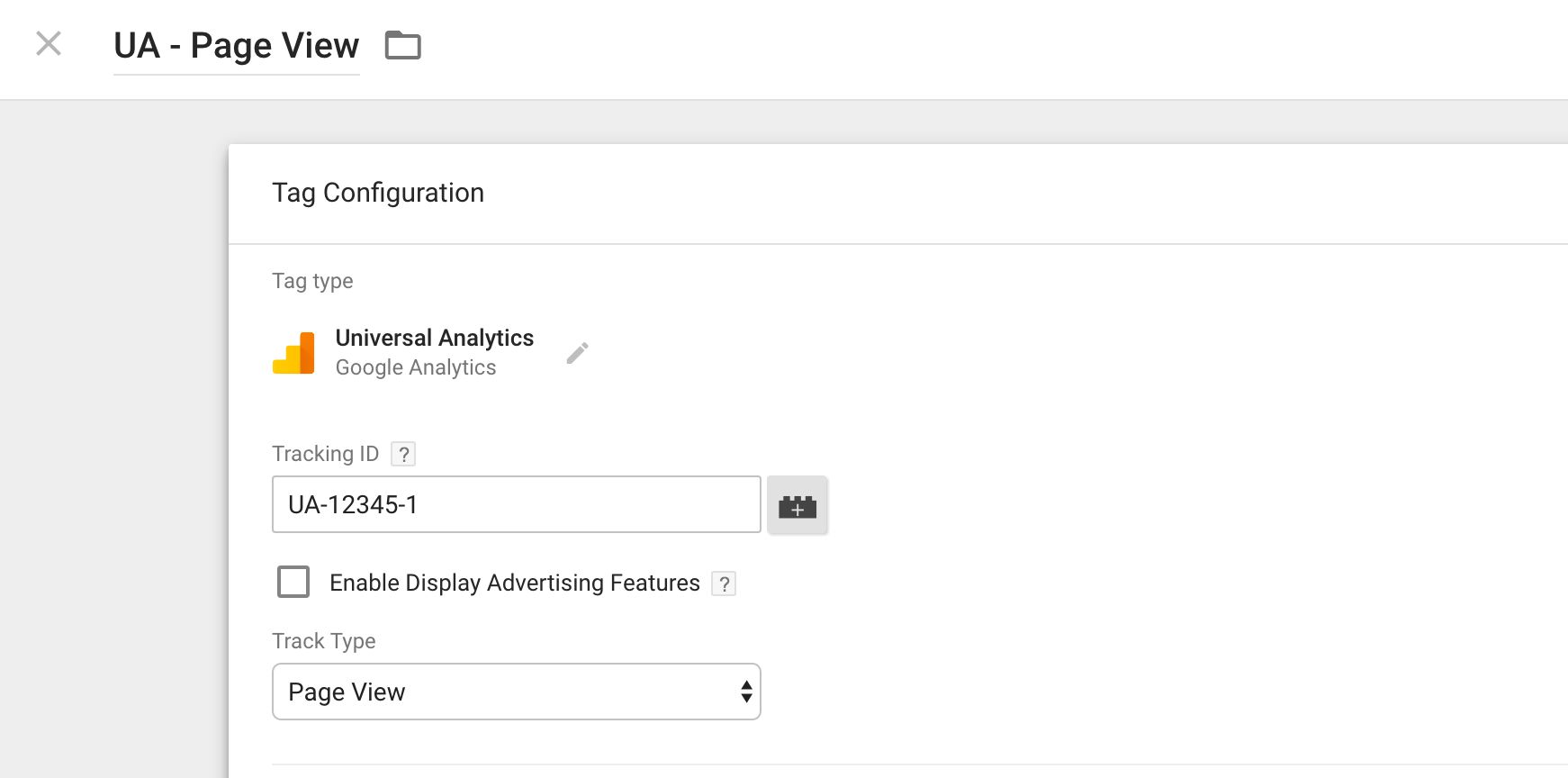
Things have certainly changed! On top of the view, the underlined Undefined Tag is what you edit to modify the Tag name. Next to it is the Folder icon, which lets you assign the Tag to a folder.
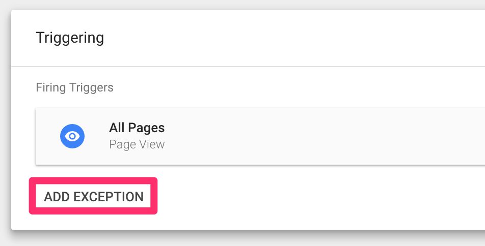
The view is dominated by the two boxes. The first is where you create and configure the Tag itself, and the second is where you attach Triggers and Exceptions to the Tag.
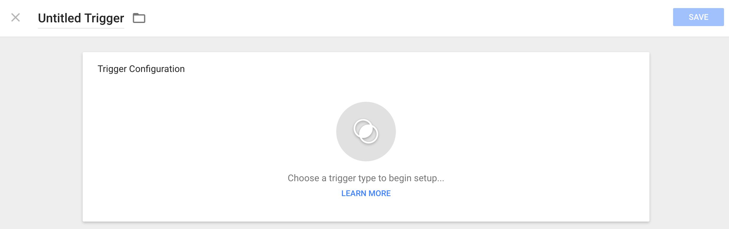
When you click “Choose a tag to being setup…”, a new overlay pops out, offering you an impressive list of Tag templates to choose from.
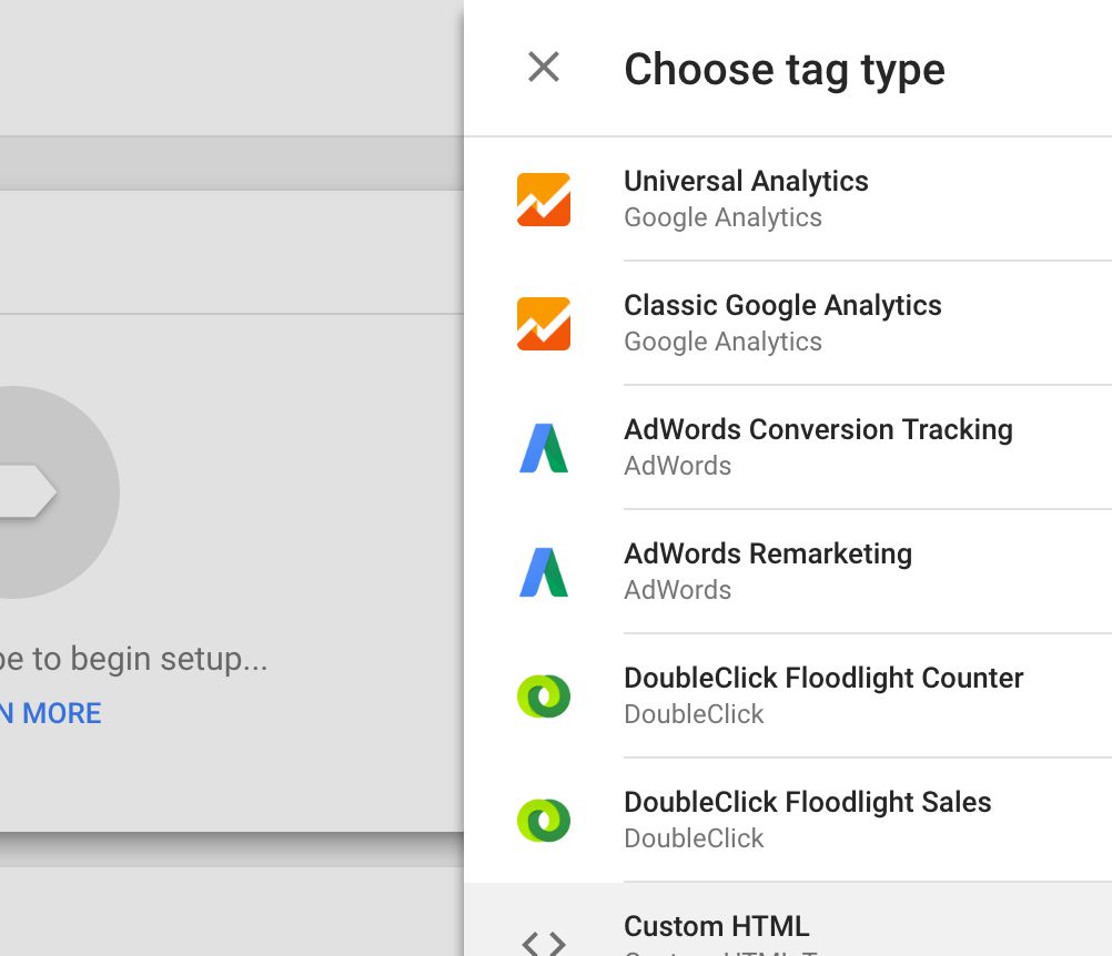
After selecting the Tag type, the creation process itself is pretty much the same as it used to be.
As for Triggers, once you click the Trigger creation panel, a more complex overlay pops out. I’ll go over these steps in the next chapter.
Do note that you will not be able to add an Exception until you have added at least one Trigger (makes sense).
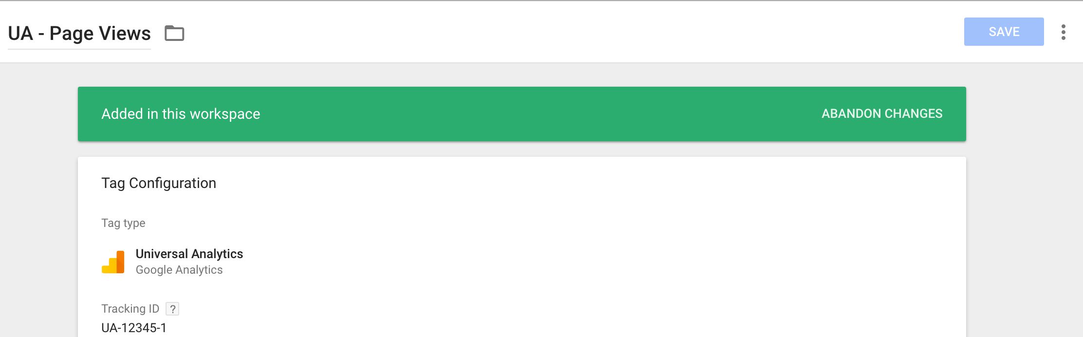
Note that if you open any Tag, Trigger, or Variable for editing, and that asset has already been edited (or newly created) in this Workspace, you will see a new selection in the view, allowing you to Abandon and/or View the changes that have been committed to the asset.
I’ve covered Abandoning and Viewing changes in more detail in the Workspaces guide.
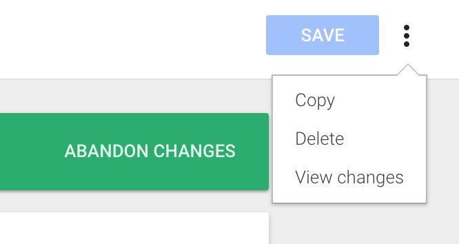
To save an asset, just click the blue SAVE button in the top-right corner of the overlay. Similarly, if you’ve opened a previously created asset, you can click the little dot menu next to the SAVE button to duplicate, delete, or view changes to the asset.
6. Triggers
Trigger selection is more robust now. The full table gives you all the information you need at a glance.
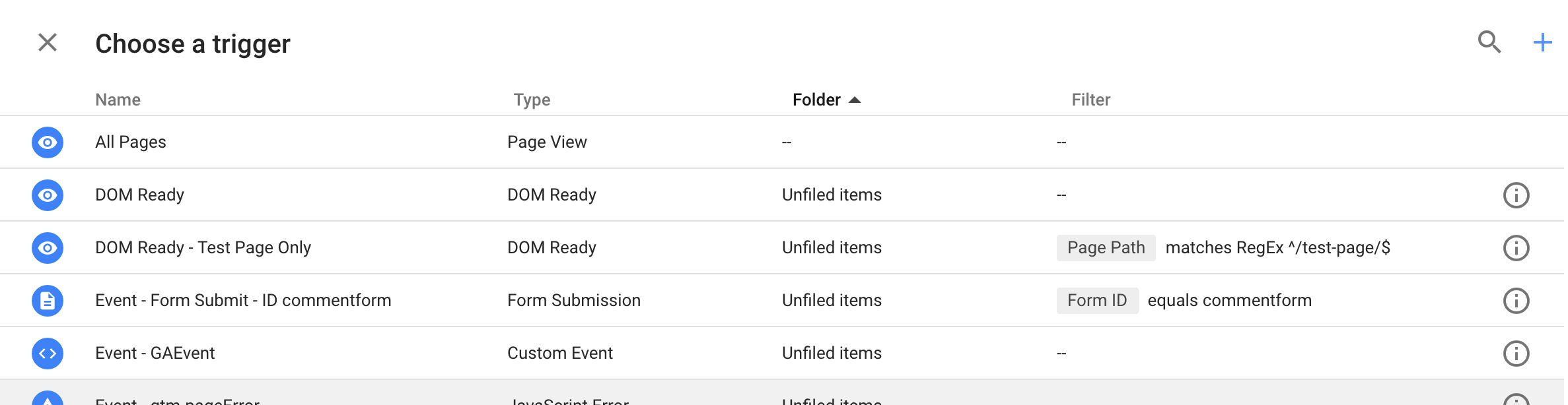
If you click anywhere on the Trigger row (except the little (I) icon to the right which opens the respective Trigger configuration), it will add the Trigger to the Tag.
The magnifying glass icon opens a search field which lets you do a filter search on the Trigger list.
The (+) button lets you create a new Trigger. When you click it, the process is very similar to creating a new Tag. You’ll see a new overlay with the same types of options you had when creating a new Tag.
When you choose the Trigger type, the iconography has been completely revamped.
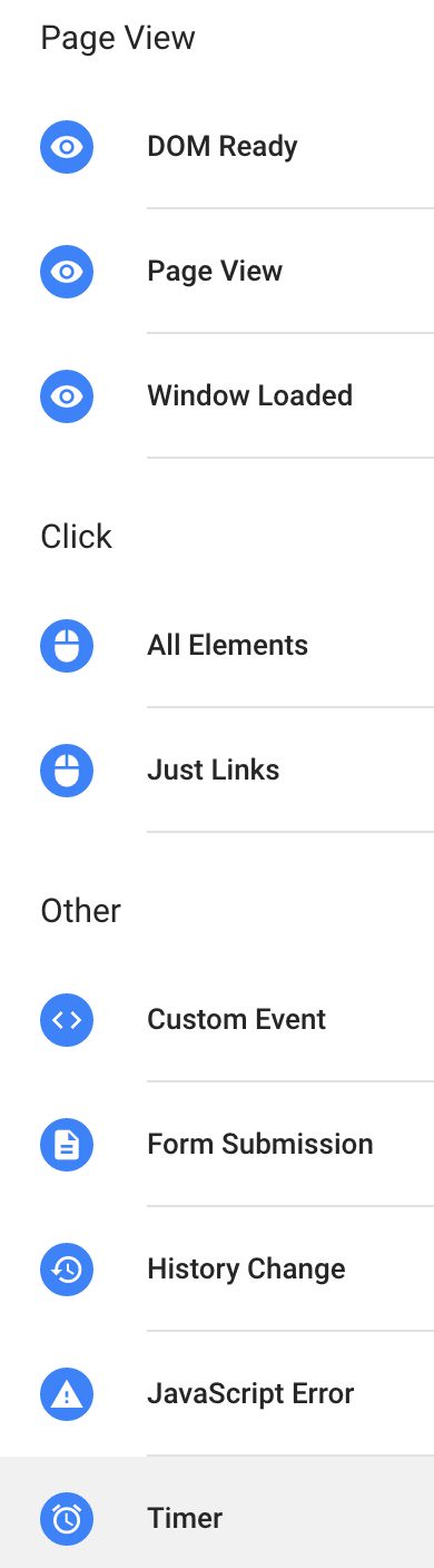
I actually miss the color-coding GTM used to have for Triggers, but the icons are much clearer and easier to interpret.
Configuring a Trigger hasn’t had any real technical changes, but the user interface has changed for some of them, especially the ones which need a separate enabling condition (e.g. Just Links and Form Submit). Instead of the “Enable When” and “Fire On” steps, and actually instead of any steps, you just have a regular, straightforward form:
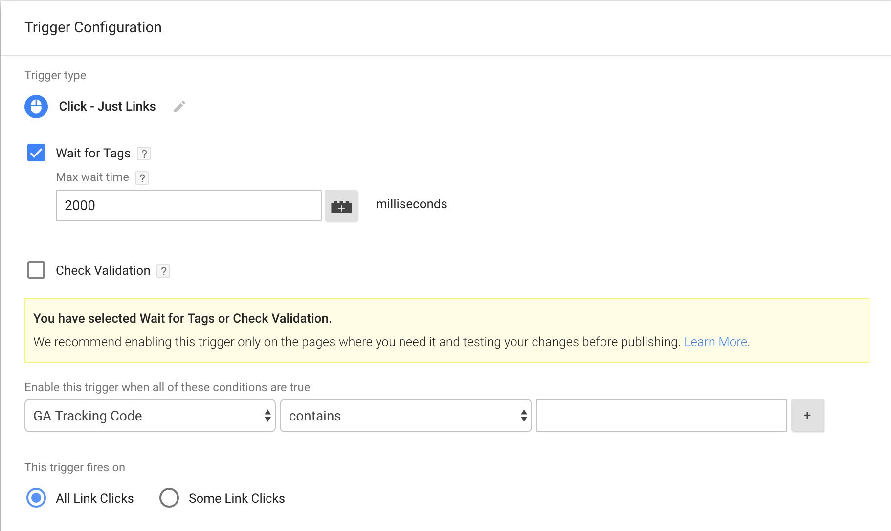
I’m not happy that they did away with the step numbers, as they made it easier to reference various parts of the Trigger configuration process. I also still wish they’d set the Page URL matches RegEx .* as the default for the “Enable When” step.
7. Variables
Variables have received a very similar treatment as Triggers and Tags. To start the Variable creation workflow, you can either go via the Variables page of the container (as you used to), or you can just click the little Variable icon wherever you see it.
Once you click that icon, you’re whisked to the Variable selection screen, which looks a lot like what you got with Triggers.
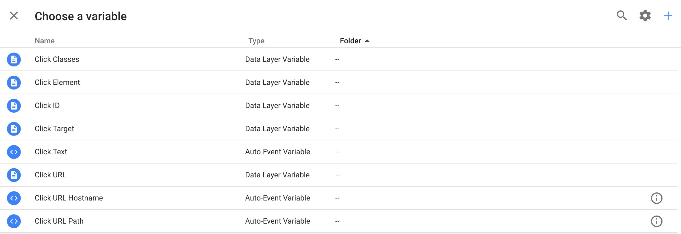
Note that the Built-In Variables are mixed together with the User-Defined Variables. The only way to tell them apart is to look for the (I) icon to the right, which opens the Variable configuration for User-Defined Variables. With Built-In Variables, you can’t do that.
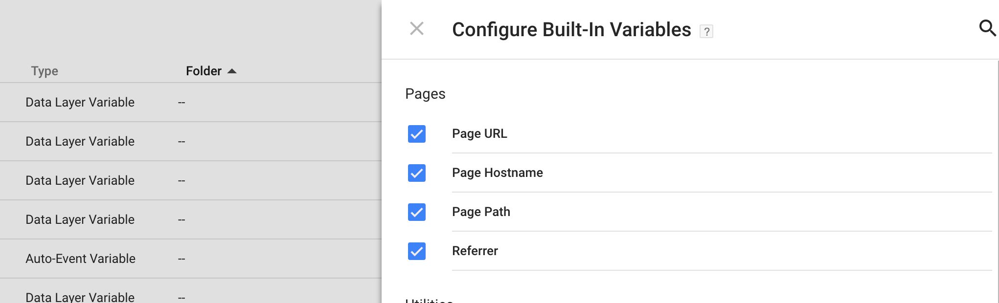
If you want to add Built-In Variables to the list, you will need to enable them by clicking the little gear icon in the top-right corner. This opens a new overlay, where you can check the Built-In Variables you want included in the container.
Now, when you choose to create a new Variable, you get a list of the types you can create, with a new iconography (just as with Triggers).
There’s nothing new in this list, though I do like the fact that you see a short description after most of the Variable types.
Configuring a Variable is pretty much the same as it used to be, so I won’t dwell on that here.
So you are now able to complete the full workflow from the first time you create a Tag all the way to its Triggers and Variables without having to change your location in the container. Yes, the horizontal overlays might come as a shock to many, and it will take time to get used to the Material Design layout, but my personal opinion is that the changes are very welcome indeed. But that was predictable.
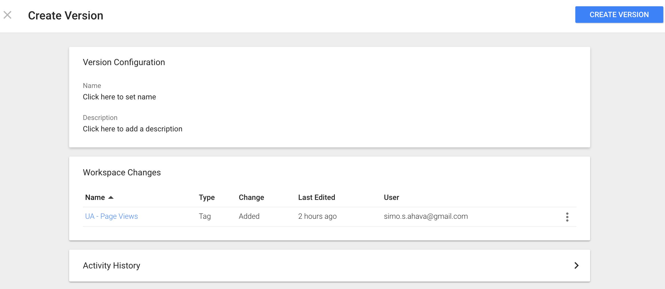
8. Publish
When you click the Publish button, it’s again, surprise surprise, delegated to an overlay.
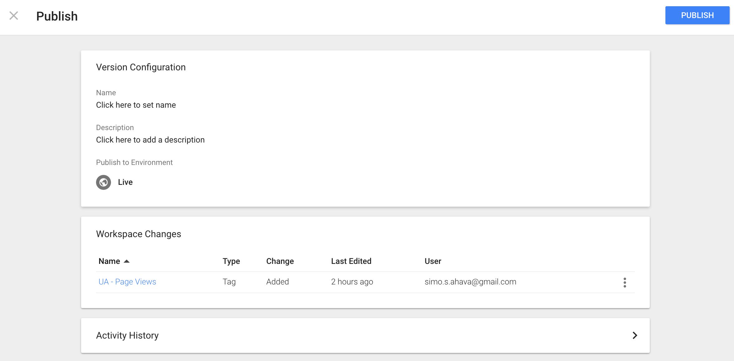
The Version Configuration is more prominent than it used to be. Now you are recommended to give a proper name and description to the version. This has, in my mind, always been vital when creating versions in Google Tag Manager. You really want to make the version name as descriptive as possible.
You also have the option of publishing only to a specific Environment, as before.
In Workspace Changes, you can review the changes that have been done to the current Workspace. By clicking the menu at the end of each row of changes, you can choose to Abandon or View Changes one last time.
Finally, the Activity History gives you a run-down of who did what in this current Workspace.
By clicking the big blue PUBLISH button you will consolidate the changes, create a new version, and make it the live version of the container, just as before.
If instead of Publish you chose Create Version, the screen will look almost the same, except you won’t have the Environment option, and instead of publishing the version as the Live version, you will only update the Latest Container Version.
Summary
These were, in my mind, the biggest and most obvious changes to the new User Interface.
As I noted a number of times above, I’m certain this new UI will come as a shock to many. There’s always resilience to change, and even if the old UI was quite clunky, there was something consistent about the way you manoeuvred between different parts of the container.
But that’s all gone now. Instead, you have horizontal flyouts and overlays that keep in you in one location, allowing you to configure an entire workflow without ever leaving the asset you started from. This, I think, is very powerful and will definitely speed things up once you get the hang of the new UI.
Workspaces is very much present in the UI. You will be able to Abandon and View Changes at almost every turn, and the significance of creating a new version has increased. This, again, might lead to confusion in the early days, as the simple act of Publishing a container has implications to all the currently active Workspaces.
Thus, I want to repeat what I said at the end of my Workspaces guide:
Communication and good governance will always rule over any feature update.
You’ll still need a stable and healthy organization if you want to make the most out of Google Tag Manager.
Good luck!