Content Dashboard With Klipfolio And Google Analytics
I have very little against Google Analytics’ default dashboards. The reason I shy away from them is because they lack the type of customization I’ve come to expect from a dashboarding tool. On top of that, they only let you look at GA data, and I learned early on in my career that focusing on just one vertical is one of the cardinal sins you can make as an analyst.
Furthermore, over the years I’ve become more and more disenchanted with GA’s clunky user interface, and the less time I spend in it the better for my serotonin levels. In fact, GA’s excellent Core Reporting API combined with a platform like Tableau or Klipfolio to manage and manipulate the data stream has become invaluable in my everyday work.
Well, in this article I want to show you a glimpse of a typical process I follow when creating a dashboard for my clients. My platform of choice is Klipfolio. It’s a pretty sweet dashboarding tool, with the added benefit of functioning as a low-level data store, where you can combine data from different data sources (and there are practically limitless integrations in the tool) as the input in your visualizations.
I shouldn’t even have to say this, as I don’t do commercials, but this article is in no way solicited or requested or paid for by Klipfolio. I’m just a fan of the tool, and I want to show you how it works.
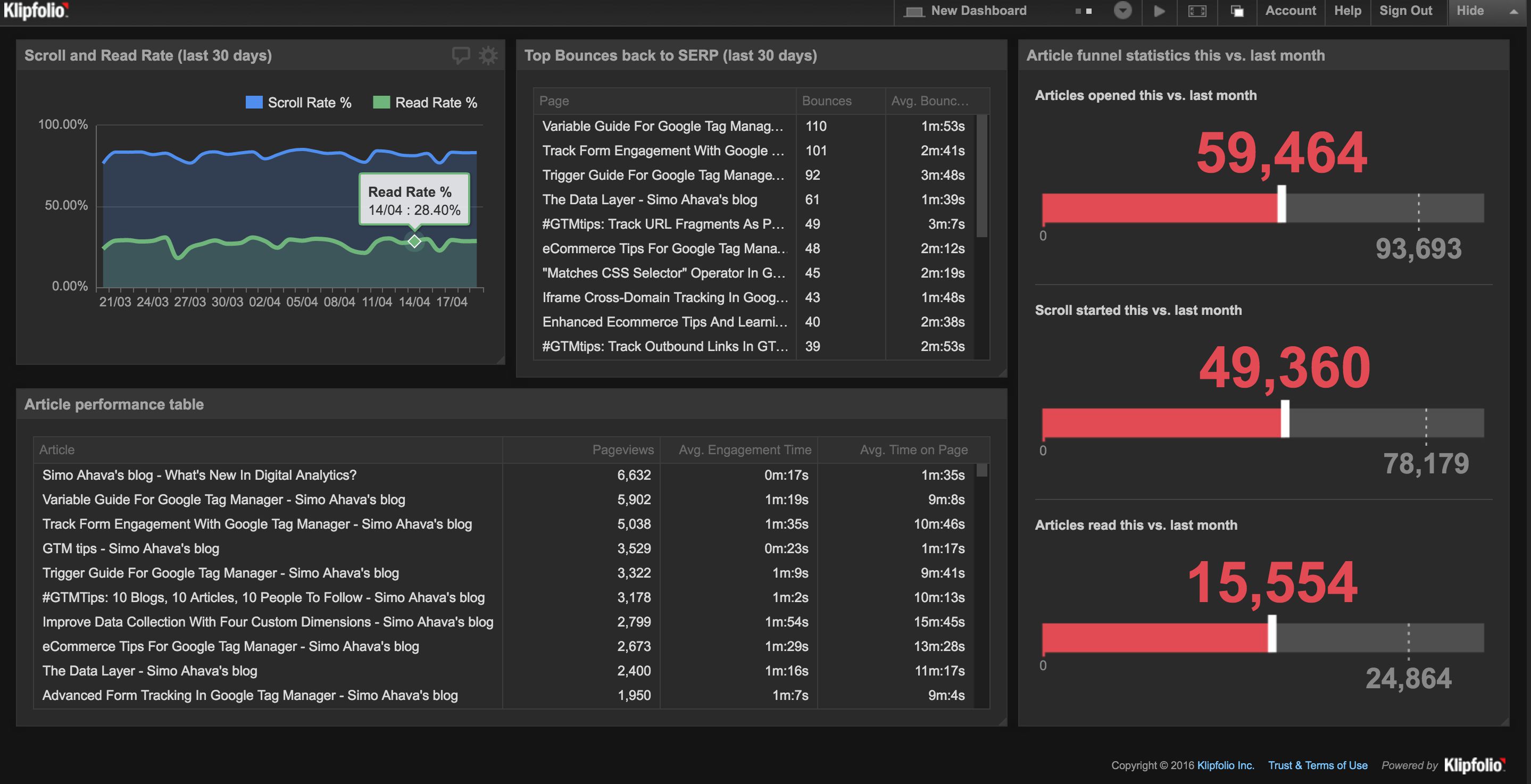
In this guide, I’ll walk you through creating a single Klipfolio widget (or Klip) which pulls its data from Google Analytics. I’ll let you figure out the rest yourself. The data in the final dashboard (seen above) is pulled from a number of customizations I’ve done over the years, mainly:
I’m positive you don’t have all these customizations on your website, but perhaps the following steps will be useful to you when creating your own Klips and visualizations.
XThe Simmer Newsletter
Subscribe to the Simmer newsletter to get the latest news and content from Simo Ahava into your email inbox!
How Klipfolio works
Klipfolio revolves around two data structures: the data sources themselves (which store the pulled-in data), and Klips (which are the widgets you add to your dashboards). This is a pretty self-sufficient system, as once you’ve created a data source, you can set it to refresh anywhere from never to every 15 minutes to every 24 hours. A refreshed data source shows up as a cool animation on the dashboard itself, so people looking at the tool will concretely see how the data set is being updated.
The Klips themselves offer you a handful of ready-made visualizations, with the option of writing your own HTML styling if you really want to customize the output. When you create a Klip, you add one or more data sources to it, so you can actually visualize data across data sets.
Creating a Klip is pretty much like working with Excel. You have flat tables of data (the data sources), and you transform and combine them with your typical spreadsheet functions. It’s pretty intuitive if you’ve ever worked with spreadsheet formulae, but if you haven’t, there’s definitely going to be a learning curve with creating new Klips.
Finally, the data sources themselves. Let me put it this way, you won’t run out of options! In addition to having integrations with some of the most popular SaaS platforms out there (e.g. Google Analytics, Dropbox, Facebook, Salesforce), you can integrate with any HTTP REST API, SQL database (with online access) and RSS feed. And if that isn’t enough, you can also send the data as email attachments, or upload it as CSV or Excel files, for example. Lots and lots of options!
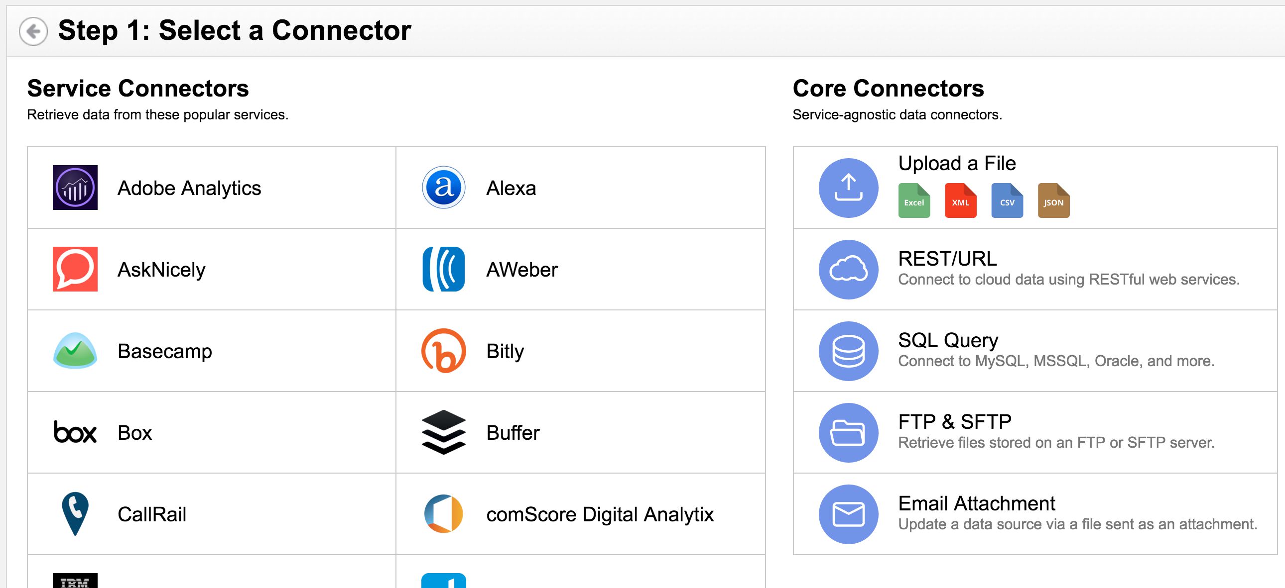
In this article, we’ll only use the Google Analytics connector, and the Klip we’ll create is fairly simple and intuitive. But trust me, there are almost limitless possibilities for data transformations and visualizations with this tool!
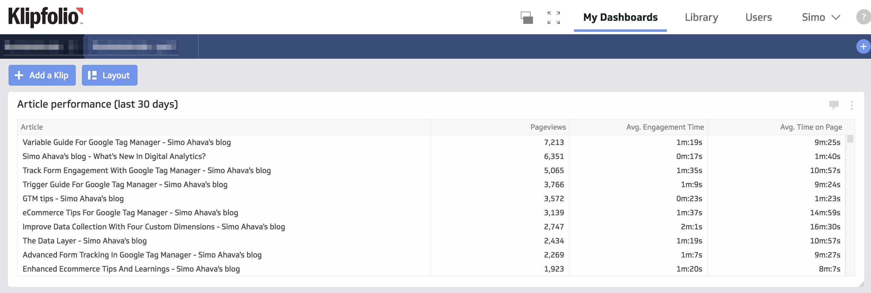
Article performance table
The Klip we’ll create is the easiest one. It’s a simple table with performance statistics on my articles over the last 30 days. The three things we’ll measure are:
-
Pageviews
-
Average Time On Page
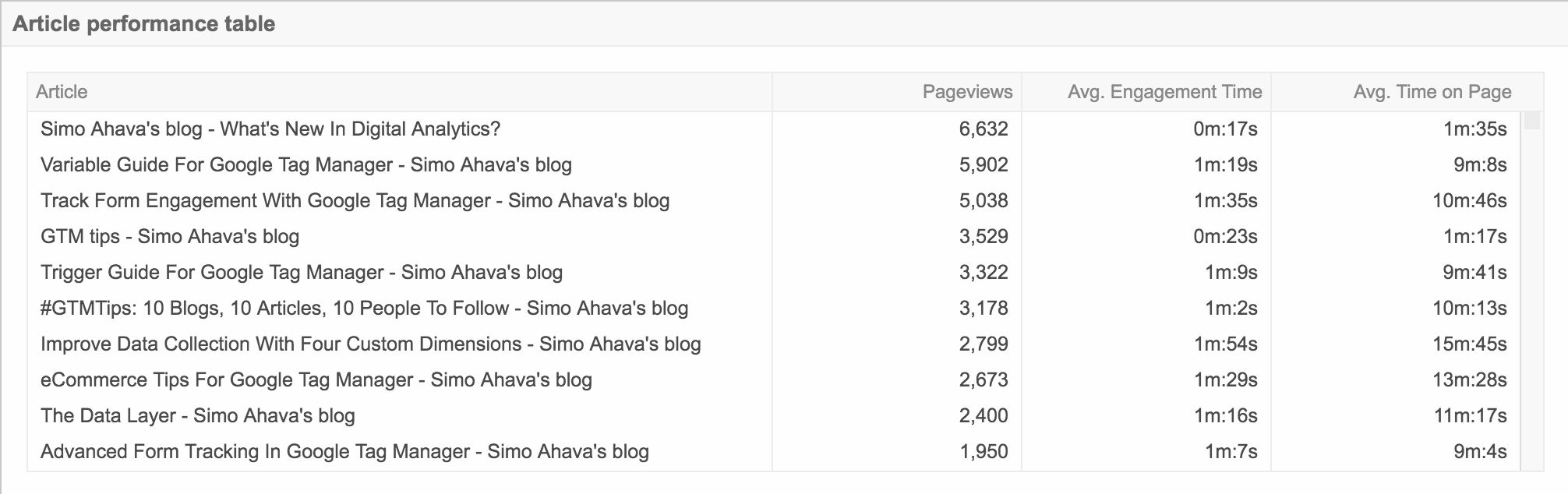
Pageviews and Average Time On Page are GA’s built-in metrics. Average Engagement Time is a customization which measures the time users actually interact (move the mouse, click around, scroll, press keys) on each page. The reason this interests me is because Google Analytics’ Time On Page metric is next to useless. It measures the difference in time between two pageviews. But this is a completely arbitrary time measurement, as it tells you absolutely nothing about how much time the user ACTUALLY spent on the page. They could have just opened it in a browser tab and left it be. With Average Engagement Time, we get an idea of how much the users are actively viewing the page.
Step 1: Create the Data source
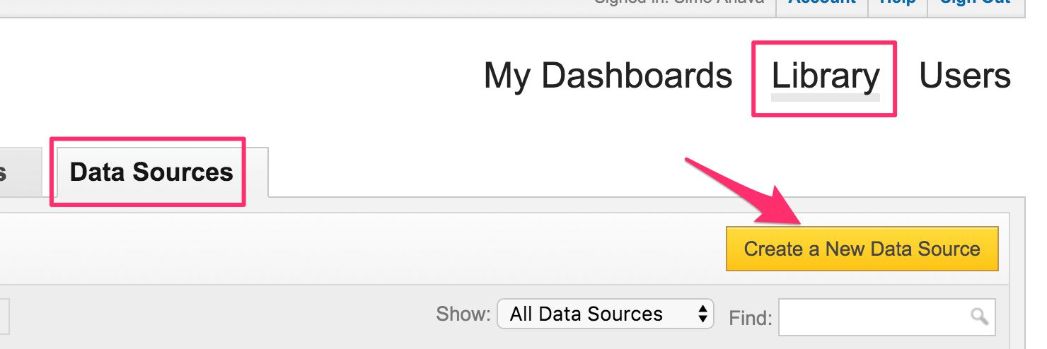
Anyway, the first thing we need to do is create a data source. Since we only have one dimension (page title) and three metrics, we’ll manage with a single data source. In Klipfolio, go to Library -> Data Sources, and then click Create a New Data source.
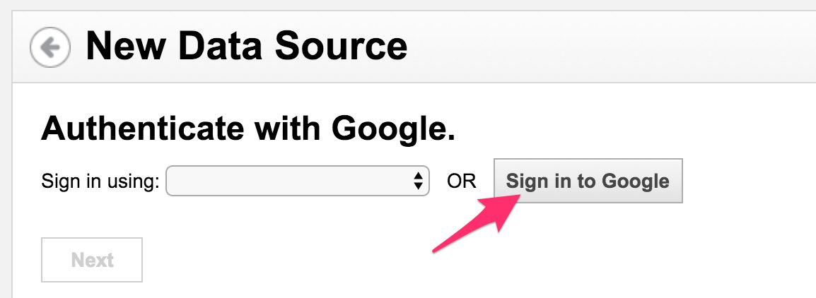
Next, choose the Google Analytics connector. You will enter a screen where you need to first authenticate with Google to allow Klipfolio read-only access to your Google Analytics data. So, click Sign in to Google, and follow the prompts to authenticate Klipfolio with the Google account that has access to your data.
Once you’ve authenticated, you should find yourself in a screen where you can Configure your Google Analytics query. You could just use this interface to build the query, but I’ve got a better idea!
Browse to the Google Analytics Query Explorer. It’s an amazing tool that lets you test and build Google Analytics API queries on your data. Note! You might need to authenticate again, so that this tool, too, can access your GA data.
So, what you need to do first is build the query in this tool. You don’t have to worry about the Date parameters, so choose any dates which give you data. The query I’m building for the current Klip looks like this:
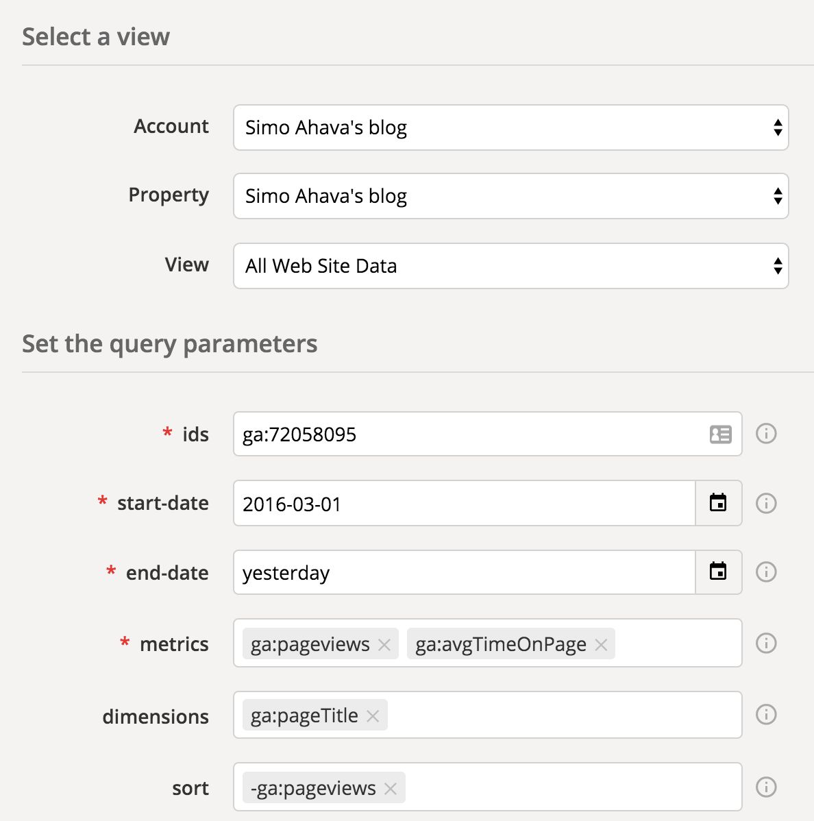
I can’t choose Average Engagement Time, since it’s a calculated metric and the Query Explorer doesn’t seem to support them yet.
Once the query is built, you can click Run Query and make sure it returns data.
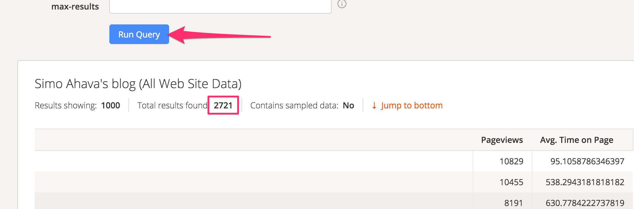
So now that we know the query works, you can just scroll all the way to the bottom of the page, and copy the whole URL string within the API Query URI text box.
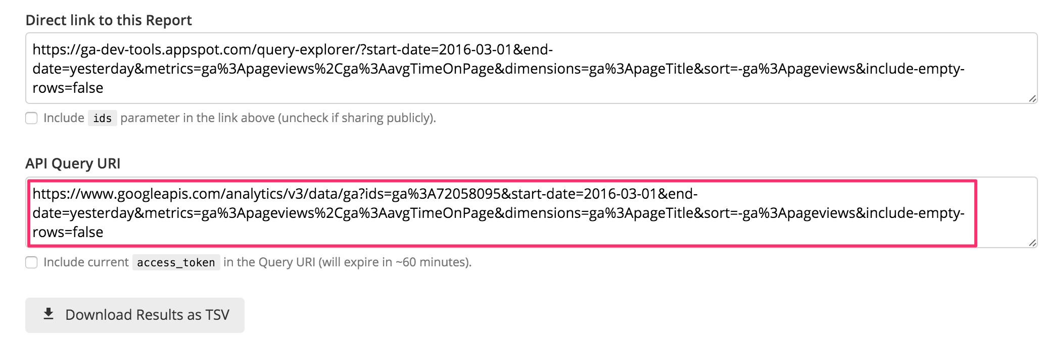
Now, go back to Klipfolio, and paste the copied URL into the Query URI box. You might need to select “Advanced” in the Mode menu first.
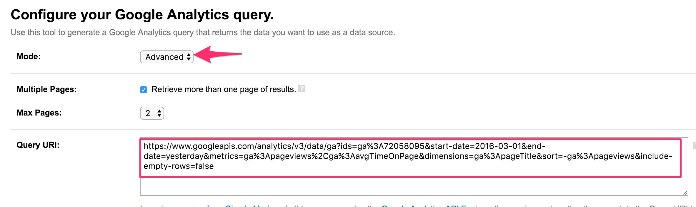
You can click Get Data to make sure that it returns the same data set you got when using the Query Explorer.
But some things were missing. First of all, we need to modify the date parameters to get only the last 30 days, and we also need to add the calculated metric into the mix.
To add dynamic date values, Klipfolio has those as built-in variables. You can read more about them here. For example, to change the &start-date; parameter in the query automatically to 30 days before the query was made, you’d use:
{date.add(-30).format()}
For &end-date; we’ll just use Google Analytics’ own shorthand yesterday.
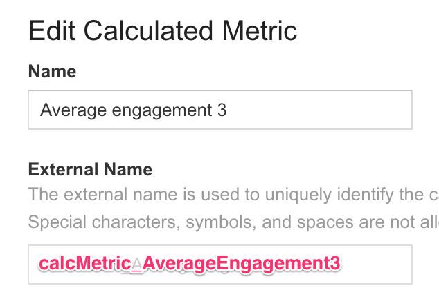
To add the Average Engagement calculated metric, you need to get the metric’s external name. You’ll find this in the Calculated Metric settings of Google Analytics, by clicking open the entry you want to fetch into the query:
To add this metric to the query, add it after ga:pageViews, separated by a comma.
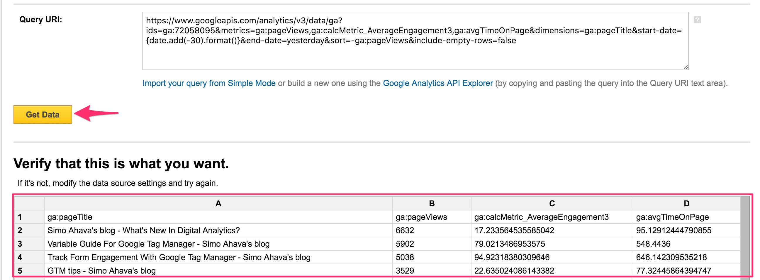
The final, complete query URL looks like this:
https://www.googleapis.com/analytics/v3/data/ga?ids=ga:XXXXXXXX&metrics=ga:pageViews,ga:calcMetric_AverageEngagement3,ga:avgTimeOnPage &dimensions=ga:pageTitle&start-date={date.add(-30).format()}&end-date=yesterday&sort=-ga:pageViews&include-empty-rows=false
In English, the query is:
“In the Google Analytics profile with ID XXXXXXXX, fetch me Page Views and the calculated metric Average Engagement 3, together with Average Time On Page. Query these against the Page Title dimension, and set the start date of the query to 30 days ago. The end date should be yesterday. Sort them by Page Views, in descending order, and do not include rows which do not have any values.”
Click Get Data to make sure the data it returns is valid.
If you’re satisfied with the results, click the big Continue button in the bottom of the screen.
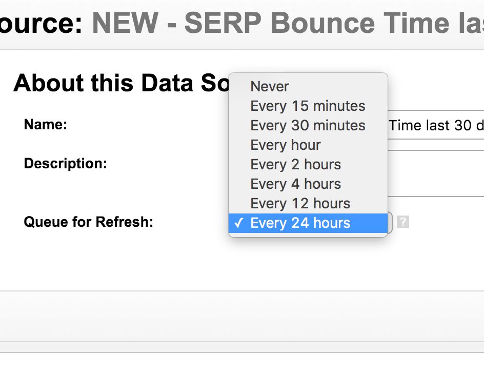
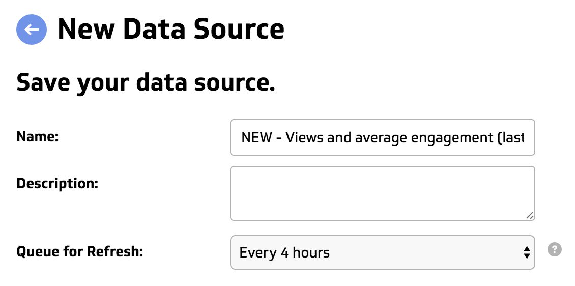
Finally, give your new data source a descriptive name and set its refresh rate. Since in this example the &end-date; parameter is yesterday, you don’t need to refresh the data source all the time, just once per day should suffice. Nevertheless, I always choose a shorter refresh rate in case the timezones of Klipfolio and Google Analytics don’t match.
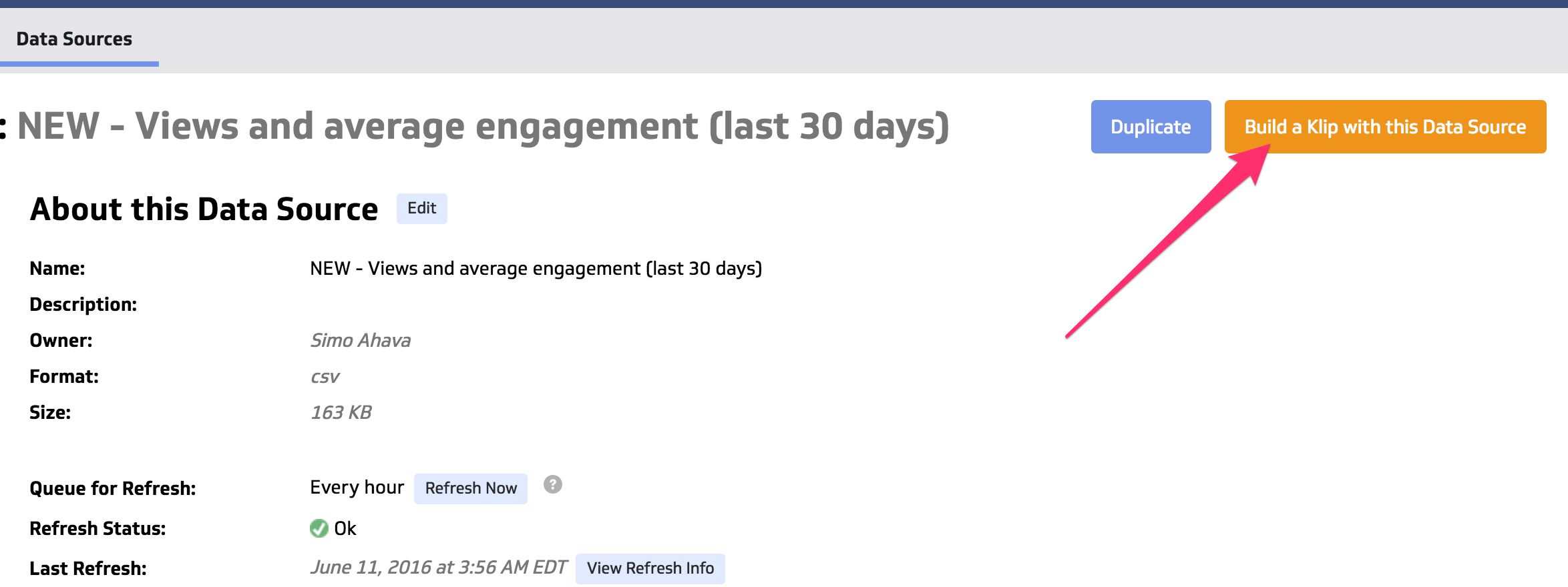
When you’re done, click Save, and you’ll be transported to the data source view for this new data set.
Next up, building the Klip!
Step 2: Create the Klip
So now we have the data source, and we’re ready to turn it into a widget, also known as a Klip. While still in the data source view, click the big orange button labelled Build a Klip with this Data Source:
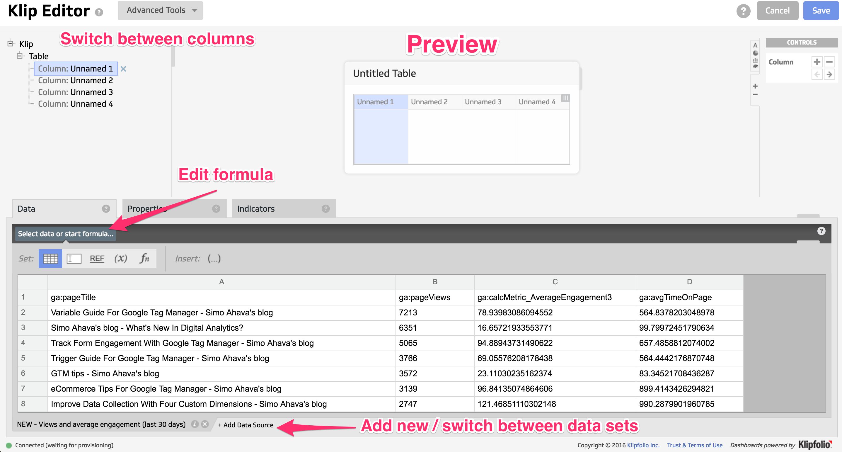
The first thing you need to choose is the component type. You can combine multiple component types in a single widget, but in this case we’re only interested in a Table, so choose that.
You’re taken to the Klip Editor. The editor lets you turn a data table into a visual representation thereof. You can use formulae to modify the data as it’s visualized in the graphs, and you can add data from multiple data sources into a single widget! This is an amazing feature, and turns Klipfolio into a light-weight Business Intelligence reporting tool.
It’s going to take some time to get acquainted with all the features of the editor, but once you get the hang of it, there’s a very simple flow to it. Here’s a great tutorial on how to use the editor.
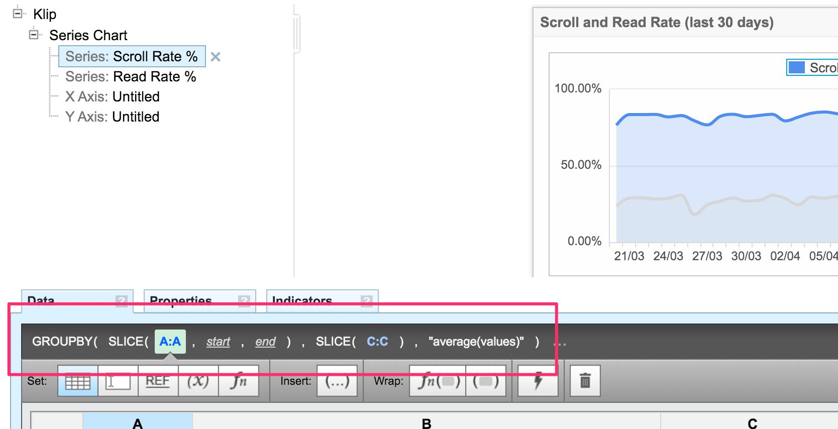
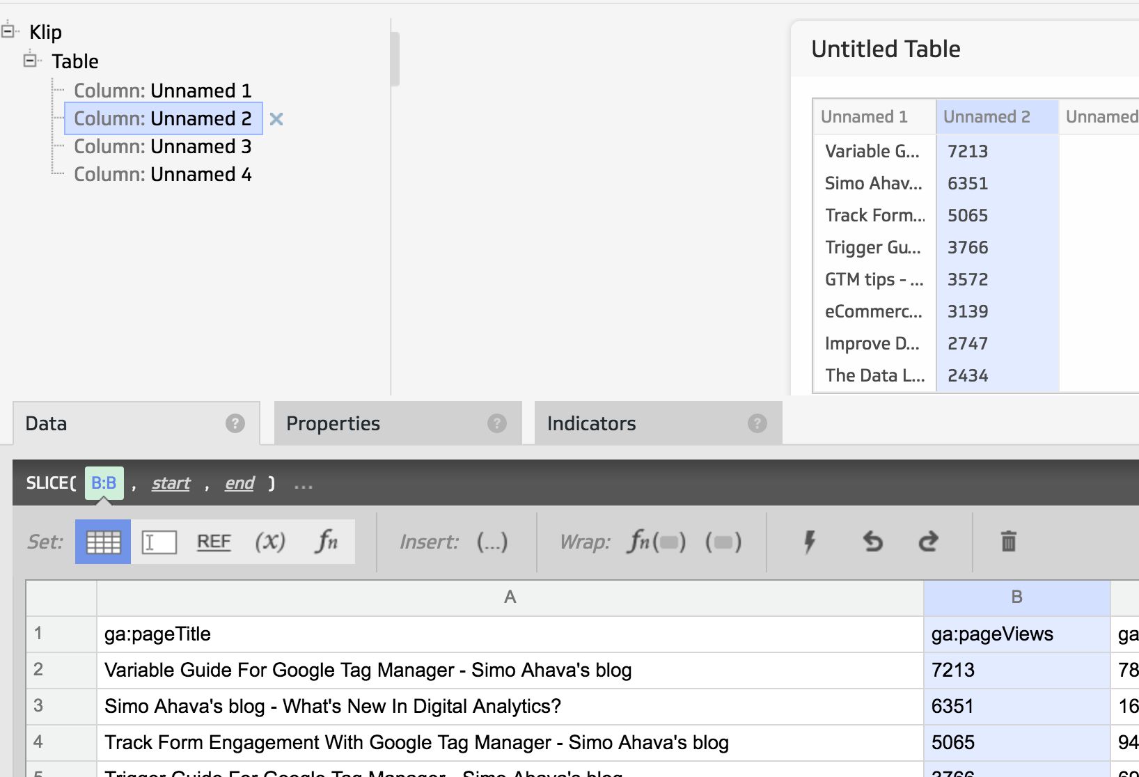
Anyway, it’s easiest to learn by doing. Select the leftmost column of the table by clicking either the column in the Preview screen or the top-most column in the hierarchy view in the left side of the editor.
The first thing we need to do is select data for this column. Because we want to align page titles with their respective pageview counts and engagement times, we’ll need to add the page titles to this first column. Thus, while having the first column selected, click the header A in the data table to select all the data in this column.
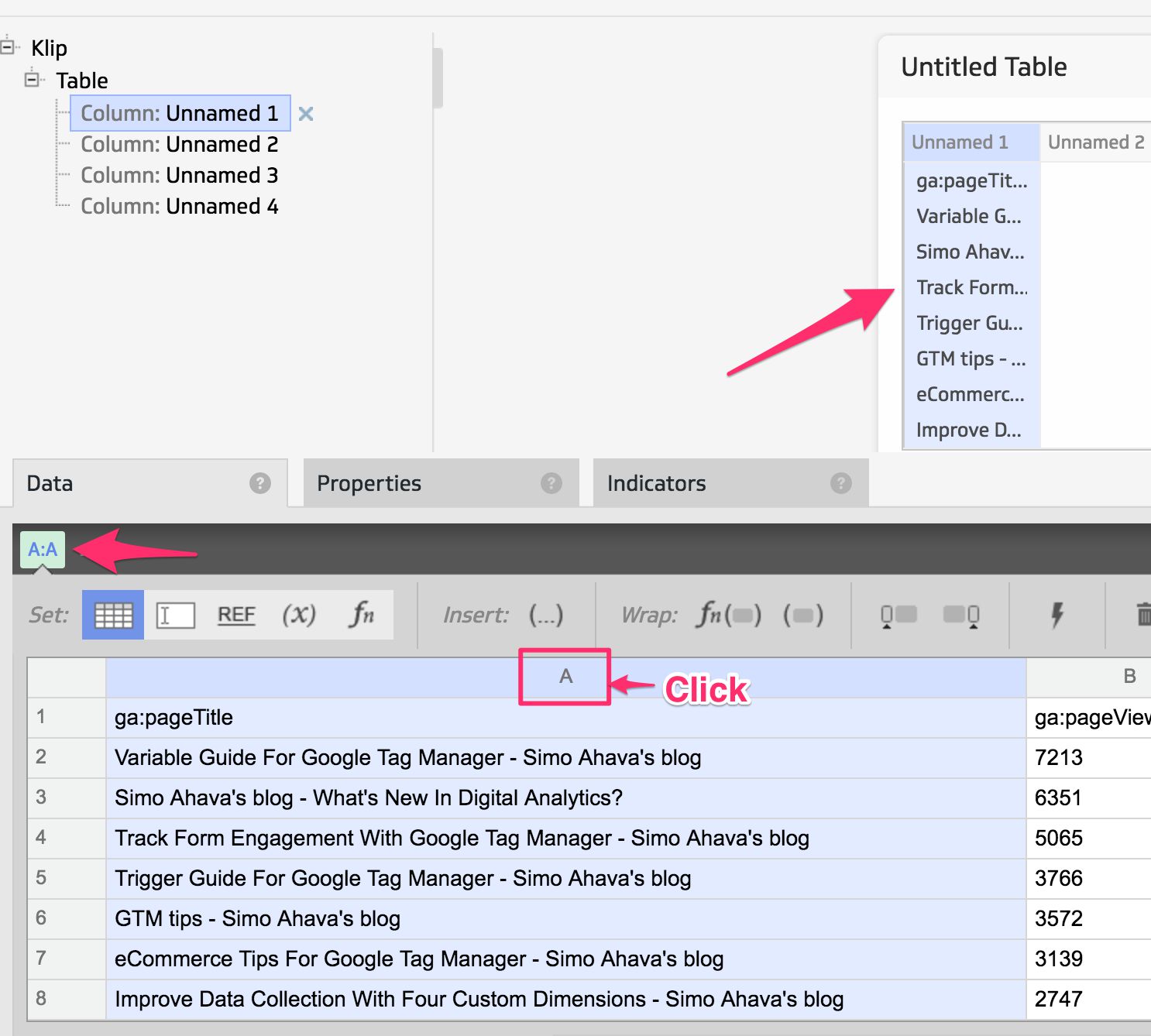
When you click the column, the following things happen automatically:
-
The formula bar gets a single entry: A:A, which is spreadsheet language for “everything in the A column”
-
The first column in the table is automatically filled with data in the same order as it is in the data source
So now you’ve created your first formula, congratulations! However, there’s a slight hiccup. As you can see, the header row (ga:pageTitle) is the first row in the chart. We don’t want that! To get rid of it, we need to apply a function to the A:A selection.
So, while still having the A:A column selected, click the Wrap Function button in the toolbar.
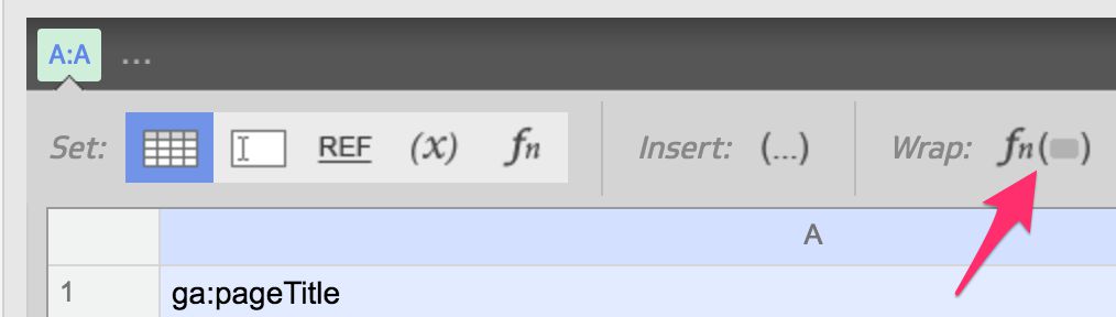
This lets you wrap a function around any part of the formula you have selected. You’ll see the function selector appear, and it has quite an impressive list of functions. Many of them should be familiar from spreadsheet tools, but you might want to bookmark Klipfolio’s function reference.
Anyway, to get rid of the first row of data, simply select SLICE from the list. It automatically removes the first row of data from the widget. Note that you can specify start and/or end as parameters, but we don’t need to do that as SLICE removes the first row by default.
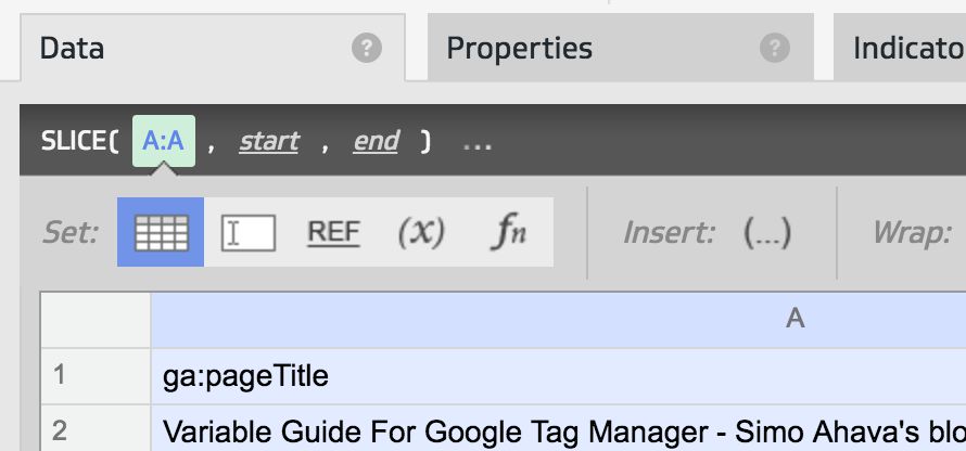
And that’s our first data column!
Next, we’ll repeat these exact steps for the column with the header ga:pageViews in the second column of the table. If you do it correctly, you should see the following:
And then we’ll do the same for the two remaining columns, adding ga:calcMetric_AverageEngagement3 to the third column, and ga:avgTimeOnPage to the fourth and final column. So now you should see this:
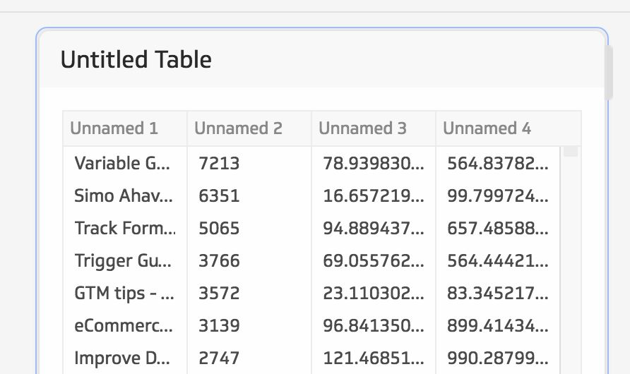
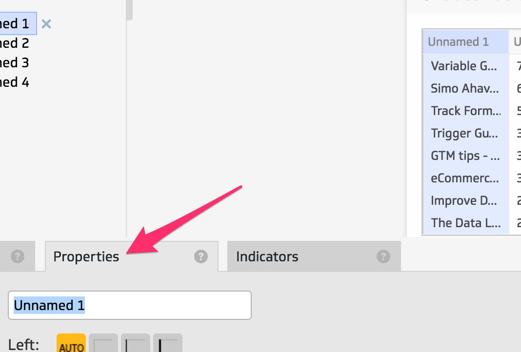
So now we have our data, but it’s not looking good at all! For one thing, the data is unformatted, and this means that the duration metrics (average engagement and average time on page) are pretty indecipherable. So, let’s start formatting! Select the first column (the one with the page titles) in the Preview, and click the Properties tab.
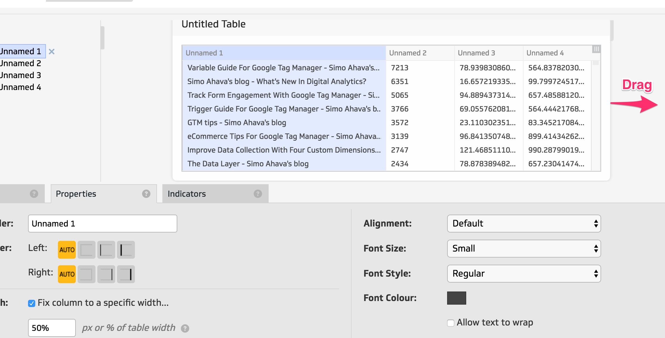
Let’s start adding some bling to the widget. First, type “Page Title” into the Column Header field. You should see the change in the Preview immediately.
Next, we want to make sure the Page Title has the largest width in the table, since all the other columns only contain numbers. So click the Fix column to a specific width… checkbox, and type 50% into the field that appears. Again, you should see the change immediately. If you want to stretch the Preview table to better see how the widget will look on a full-screen dashboard, you can resize the table by dragging from the right side.
That’s better!
Next, choose the second column, and go to Properties again. First, set the Column Header to “Pageviews”. Then, select Number from the Format As menu. This formats the numbers with commas as the thousands separator.
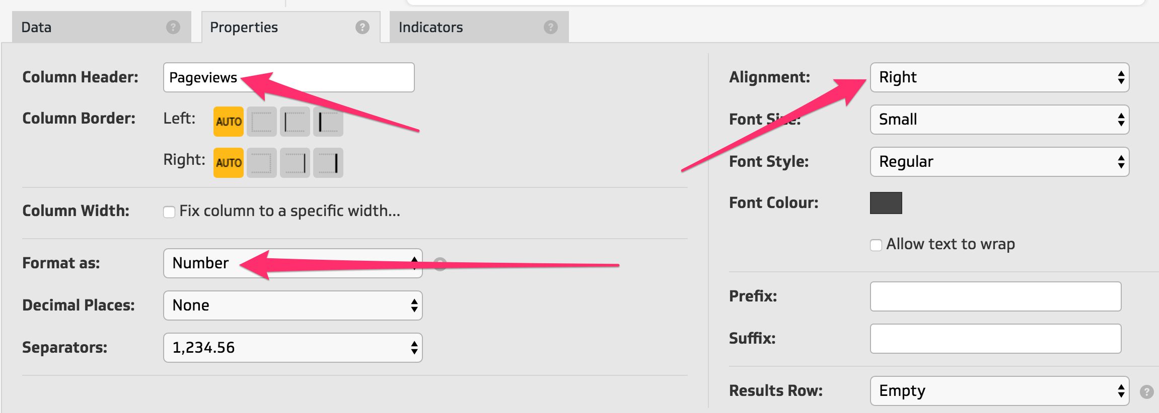
Finally, since it’s a column of numbers, make sure they’re right-aligned. If you don’t like this practice, you can of course leave it as it is. Now the table should look like this:
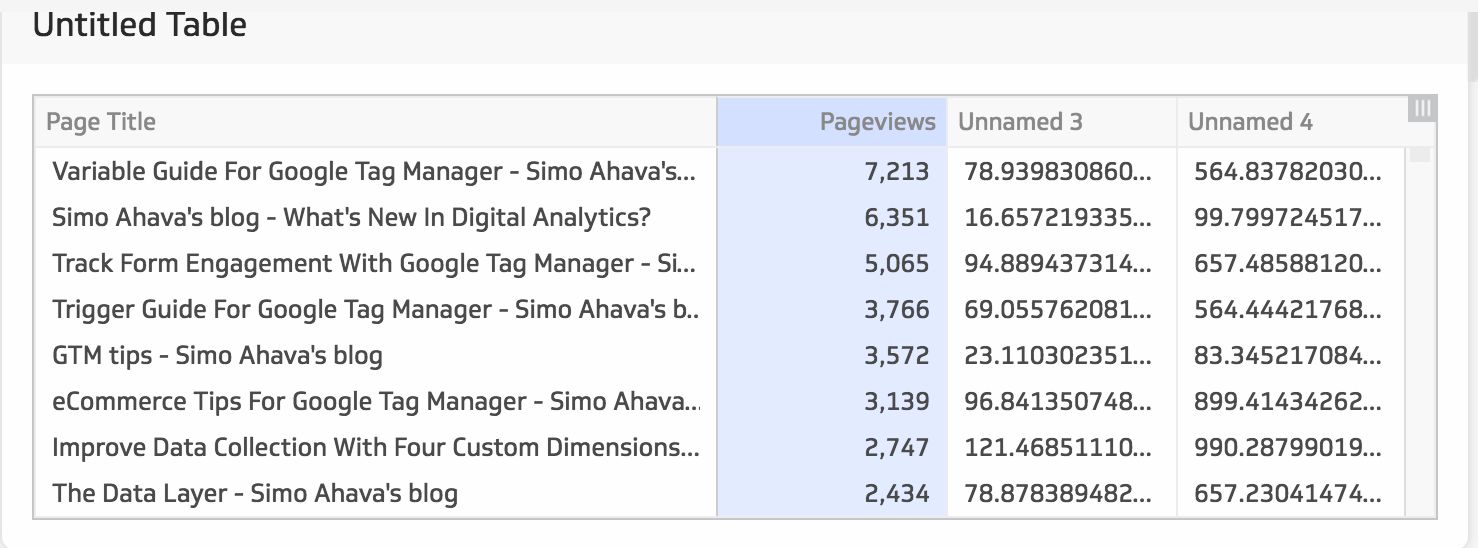
Next, choose the third column and click Properties. Set the Column Header to “Avg. Engagement Time”, and choose Duration from the Format As drop-down. This will automatically convert the numerical value in the data set to minutes and seconds. So 78.135353 in the data set, for example, would become 1m18s after the formatting change. Finally choose Right-alignment again to make sure the alignment matches the previous column.
Repeat these properties in the final column, though remember to change the Column Header in the final column to “Avg. Time On Page”.
Now the table should look like this:
So now all that remains is to give the widget a descriptive name. Click the Untitled Table header to open the Klip Properties view.
Give it a descriptive name, such as “Article performance”.
And you’re done! You’ve just created your first Klip! If you’re satisfied with what you’re looking at, click Save. You can give the Klip a new name here, though it defaults to the Klip title you just edited. This name is what the Klip will have in your library. The dashboard will show the title you chose in the editor.
When you’re done, you’ll be taken to the View Klip screen. Here, you can click the orange button labelled Add to Dashboard to add the widget to a dashboard. Here’s what a sample placement might look like:
Looking good, if I may say so myself! Check out the Dashboard Tour on the Klipfolio website for more information on the dashboard view.
Summary
All the steps above might seem quite complex, and I’m not trying to cheat you into thinking otherwise. Klipfolio isn’t a one-click, turnkey, simple, easy or fast solution for dashboarding. Nope, it replaces all that vacuous marketing jargon with one word: efficiency. It has an impressive feature set for its price point, and most importantly it lets you transform the incoming data stream.
On top of that, you can create your own intermediary data stores, join data across data sets, poll an impressive array of data sources, and get pretty much any data you wish into your dashboards.
Klipfolio’s main shortcomings at this point are its multi-user functionalities. A single user only has one “My Dashboards” view, so you can’t create a separate dashboard view for each of your projects, for example. You can add multiple dashboards to the single view, and Klipfolio will very smoothly transition between the dashboards at the time interval of your choice (if you click the Play button). But if you want one project to only see dashboard set X, and give dashboard set Y to another project, you’ll need to have multiple Klipfolio Users in the same project.
Another thing that sucks is that the Library views have no folders or any other hierarchical representation. This is why I have to use a convoluted naming convention for each set of related data sources.
Klipfolio have updated their pricing models with affordable options for agencies and users with multiple dashboard needs, so I’m definitely going to take a look at those soon.
Klipfolio has a learning curve, as do all good things in analytics and life. If you’ve followed my writings over the years, you’ll know how disenchanted I am with the marketing messages that try to make everything “simple” and “just drag and drop” (yes, Google, I’m looking at you) without exposing the actual customization power of the underlying tech. I’m sure Klipfolio will at some point focus on explosive growth by adopting the same marketing tact, but for now it’s refreshing to know that there’s such a powerful platform at its price point.